Showing posts with label Working in a Series. Show all posts

Friday, August 9, 2013

A Variety

I have not finished anything else this week.  I have been hopping around pulling out different projects.  I like to be working on a lot of projects at once.  I am very easily distracted.  I can be in the  middle of quilting a section of a quilt and suddenly jump up and start playing with another design on the wall.
Rather than pound on myself for being "scattered" I prefer to think of it as overflowing with creativity.

I got kind of bored with the two pieces I planned to quilt this week.  I was not terribly  unhappy with the quilting, but doing it on the machine with walking foot can get very tedious.  My biggest problem is how to make "U-turns" that don't look messy.  I have my little pieces that I bought from Lisa, and I look at her photos on her website, but I don't know how she makes her edges so neat.  Somehow she is able to stitch over things and get the stitches to land in the exact same place.  Practice, I'm sure, is the key.  But it tells me that I'd better get serious about free motion quilting. Which also means more PRACTICE.  Sigh.

Here's what I've been up to:
The two pieces to be quilted:
This was my prototype for Working in a Series last year.

This was a challenge for FFFC.  Abstracted Van Gogh.
I almost hate to admit it, but I've been sucked back into "Dear Jane."   Sometimes doing something teeny and precise appeals to me. Another thing I need to get good at.  I don't see my real art being that way but there are always times when I get frustrated by my lack of technical skills.  So I spent about 90 minutes Wednesday and Thursday piecing block A-1.  They finish at 4-1/2" so blocks are made 5".  5" and 28 pieces.  1-1/8" half square triangles.  I had fun trying out this method for making eight at once.  Thank you Katie.

I had an epiphany about Jane - I do NOT have to make all the squares.  Not only that, but I can make DIFFERENT blocks too.  I can make up my own, if I want.  I have no desire to do the applique blocks. I have enough hand sewing backed up to get me through a winter worth of TV, why do more (badly)?  I can just keep making random blocks until I am bored.  I have been loving watching the Tula Pink City Sampler bloggers.  But I am fighting the urge to star one of THOSE too.  And the urge to buy the book!

Instead, I plan to mingle Modern blocks and Jane blocks to my hearts content.  Maybe that's stupid, Jane is the ultimate in fussy, Modern Quilters are the ultimate in loosen up already.   But what the hell, maybe it will be like Grandma meets Modernism.  
I also realized that in addition to a selection of teal-ish fabrics bought for Jane, I have a bunch of teal-ish fabrics bought for Tipping Point. So I might do the whole thing in shades of teal.  Or I might add a second color.  Or two.  Or ten.   Here's my progress so far:
Yeah, seven blocks.  But look at that sucker in the upper right.  That's the one from last night.  And if I may say so, the points are pretty damn good.  ;)   The one on the upper left I made up when I was practicing the HSTs.

Some other oldie-moldies that are back on the design wall:
Pink and Black nine-squares.
Sorry about the crappy picture.  
I started this really early in my career, when I was still interested in more traditional stuff.  I bought a whole lot of pink and black fabric because I had Zero quilting fabric.  Now I'm thinking about whether it should be anything or just scrap it.  What more creative thing can I do... ?
Carol Taylor Class
I NEED to finish this because I spent waaaaay too much money on her fancy yard.  Really?  I need 6 different yarns for this 18" square piece? What am I ever going to do with all that??
What to do with this project from Nancy's class is more interesting.  I thought at the time that making a diagonal cut seemed like the way to turn it into something.  While it hung on the wall I realized it was nothing, horrible, a mish-mash.  So I took it apart and stuck parts back on the wall.  But I'm thinking I have to take out the slash.  At least for now.  So those pieces are wasted.  Oh well, it will be smaller.  

P.S.  I forgot to add that I am spending WAAAY to much time on Pinterest.  I've become sort of hooked on seeing my followers increase. Not that I'm vain or anything.  :) But I have gone from 4,000 last weekend, to over 4,500 today.   I like to search out new things on the web to post, rather than just re-pinning from the people I follow (bcs. my followers probably have already seen those things too).   It's a guilty pleasure, that at least doesn't contain calories.

I guess since this post has lots of stuff on the wall, I'll link up to Nina Marie's Off The Wall Friday!


Monday, February 4, 2013

If This is Slacking Off...


I'd started to title the post "Slacking Off," because I felt crummy yesterday, fighting a cold, and felt like I wasn't really getting things done, and because I didn't sandwich and baste the big quilts, which was one of my weekend goals.  Probably because I don't really want to.  I'm insecure about how to quilt them, and concerned about making a mess.  So I procrastinate.  

But when I went downstairs to take pictures of my latest dyeing adventure, I found I have been doing quite a bit of  "stuff."  Here's a selection.  I'll write a separate post about the dying process next.

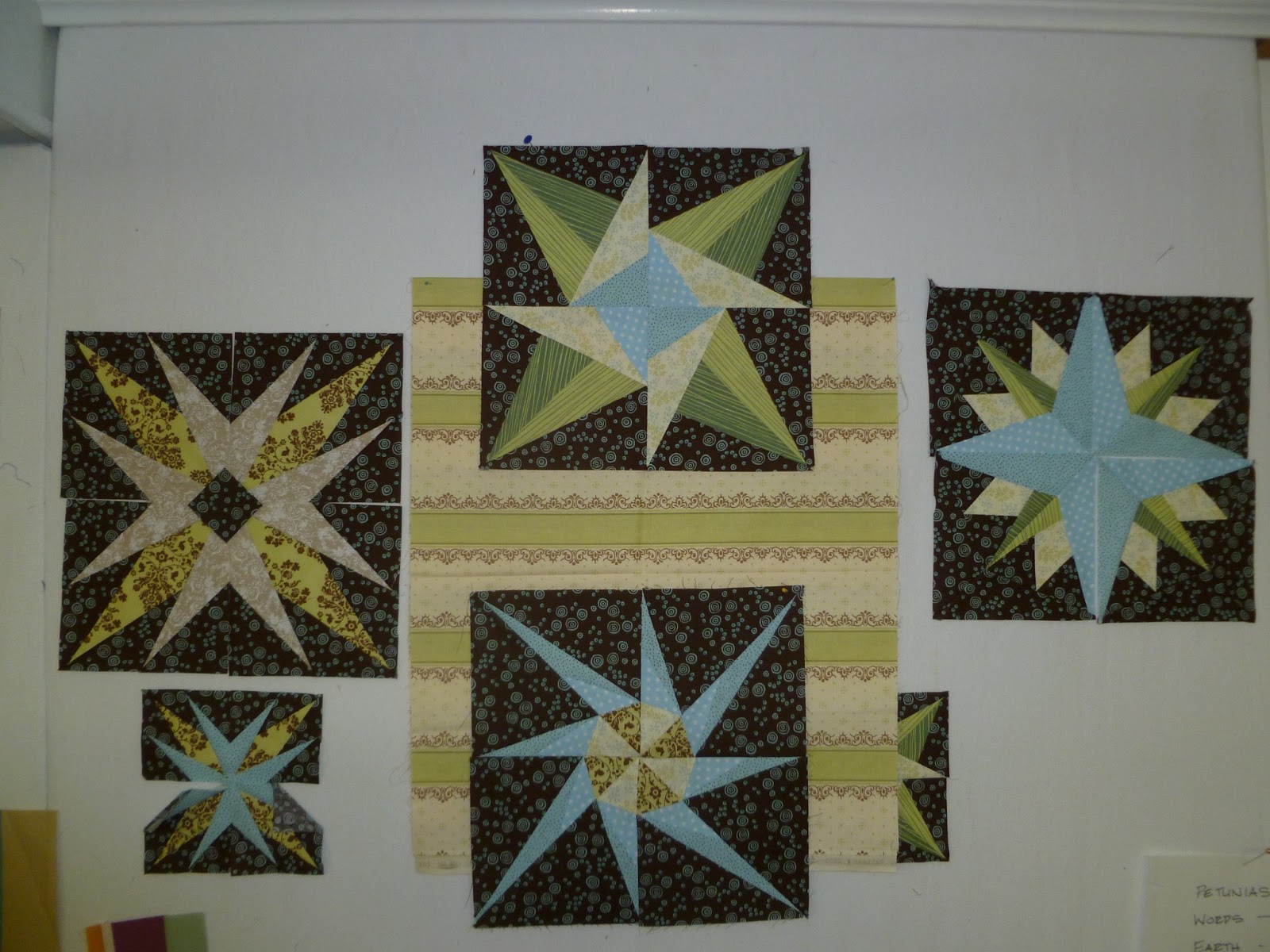
The Star Obsession continues.  The February block was released on 2/1/13 by Don't Call Me Betsy, and I had to start it first thing.  It is the one on the left.  I didn't like the way my beige and green points sort of muddled together in the center, so I added a diamond.  I haven't decided if I'll just applique it on, or piece it in on each of the four points.
It seems like this stripped fabric would make really cool sashing, if I have enough or can get more. It's from a line called Lily & Will which coordinates with some of the other prints.  I think when I get nine of these guys done, I'll make them into a wall hanging.  In addition to the QAL by DCMB I'm making some others that I found free.  The first one was on Craftsy, but the rest are available via Quilting on the Square.  They are called "Which Way North?"  The one on the right is from that group.  

These are the pieces of fabric I painted with my new art group last weekend.   They look more interesting on the wall than they do in real life.  I'm not sure what to do next, so I just stuck them on the spare design wall.  Otherwise they'll fall into that UFO black hole.
I also made a minor revision to this piece last night. This is the revised.  Can you tell what changed?   Sometimes it's hard to remember what you were thinking three months ago.


...but I'm really not sure why there was a pale pink line in the upper  part of the right side.  I like the new one much better. And that green strip was just sitting on the table waiting for me to use it.

The parts and pieces that were at one time slated to become part of  WIS #5 are back on the board, which lead me to trying this arrangement.  My goal now is to make three smaller pieces, and not put them together into the "standard" size and shape.  

So I guess that I will let myself off the hook for being a slacker.

Wednesday, January 23, 2013

Back to Work

It seems that the requisite down time of by brain has been completed.  After finishing my classes, getting through the holidays, and cleaning up from the holidays I didn't have a strong urge to create art.  Nonetheless, I pulled down the granddaughter's quilt and put the WIS projects back on the wall last weekend.  That seems to have been enough to trigger action.

Than and the growing feeling that Nancy Crow is now only about six weeks (SIX WEEKS!?!) away, and I need to have my stuff ready to show!!


Saturday, December 15, 2012

WIS Assignment #2 - Space and Scale


It's been a  slow go here with the blog, excuses range from seasonal chaos to being a landlord, to a complete hard drive melt down.  Nonetheless I still have high hopes of writing about and posting more details of my Working in a Series pieces.  At this point three quilt tops are done, #1, 3, and 4.   Today's feature is #2, which is currently in many pieces.  I still have some hopes of "finishing" it, or at least sewing it all together.  This was my least favorite of the five pieces.

This picture is how it looked when I submitted it at the deadline.The assignment as I interpreted it ( we were encouraged to start with the proposed topic and define our goals and the exercise we planned to do in a way that was meaningful to our particular medium, style, etc.) was to try to convey a sense of depth or space by overlapping elements, and also to focus on the figure/ground relationship.  I attempted to do this by using value to make dark pieces stand out on a light background.  I also used the shape of the cross-bar or tee to create the effect that the dark green piece was behind the lines.


I felt that to achieve a clear figure ground relationship I needed to exaggerate the values I used.   This is my least favorite of the five pieces, and it was a big disappointment after liking #1 so much.  Yes, there are clear figures (dark) on ground (light) and yes, there are some interesting compositions in the individual "vignettes" (my term for these little "units" I like to make), but as a whole this piece just sucks.  It sucks because the figures are just blobs. And they are bumping up against the edges of the composition, or just floating in space, neither of which is really interesting to look at.  

The way the dark bit in the upper left just barely touches the green bit that passes "under" the cross bar is annoying, and the sense of a square that it and the pieces below it are supposed to make is destroyed because it's awkward shape is jumping off the page, and the lower pieces connect to their mates on the other side, not to the square.  I thought it would be enough to make the shape, but without value as part of the definition, it doesn't work.

I should abandon it, but I have taken that upper left piece apart to see if I can find something more satisfying.  I tend to want to fuss and slave over a bad piece, when I should just toss it and move on.  I should learn that it's very unlikely that fussing will transform a bad piece into anything better than a mediocre piece.  Why put all that effort into something that will never be good?  
I guess because I learn from it.  I can see that this is bad, so if I can see that I should be able to figure out why it's bad.  And that should lead to knowing how to make it less bad...

Following are some photos of other variations I tried, other units that were deemed too ugly or too mid-value to create figure ground...  So you can see, or at least I think I can see, that the final piece was at least an improvement!
In this one I am overlaying pieces on #1 to get the size and proportion right.
I struggled and struggled with that gray part, and it never did make the "cut."


Here are some other variations.  Part of the problem is I just DON'T LIKE RED.


As you can see, it received way more attention than in was worth.
So that's the scoop on assignment #2.  Chalk it up to another learning experience.


Wednesday, November 21, 2012

WIS Assignment #1 - Color and Value


Assignment #1

I stuck these posts of my workshop series up as placeholders until I could get back to write more.  It was pretty intense trying to complete the series during the eight week workshop, and there was no time for blogging.  Now that I've had time to breathe, I will look back at them, share some of the thoughts that went into the creation, and the learning experiences.

This was the first piece I made, and by far the best.  That seems a little ironic, and it was disappointing when the following works didn't live up to the first one.  In retrospect, it's not surprising, since each piece had additional assignments attached.  This one was simply about use of color and value.  Moving forward the assignments needed to be about line, shape, texture, etc., while still using value and color successfully, so instead of following down the path I started exploring, I needed to move on and respond to the assignments. In the end it was for the best, because each exploration generated more and more ideas for possible future works or directions for series.

In this one my goal was to create a "High Value" composition.  (the concept of high = light, low = dark is counter-intuitive for me) As I began selecting and putting together the strip pieced fabrics,  I felt I really needed to have a light-medium range so that the piece was not too boring.   I think I succeeded in making a good piece and an interesting piece, but not really a high value study.  This was my first encounter with the question:  Do you pursue your goal, assignment, sketch etc., or do you make good art?  I tend to get too obsessed on following directions and not enough on trusting my creative instincts.

Fabrics small  Here are some of the fabrics I created.
I do love to compare how a pieced fabric became a composition.  Here are some examples:
fab 1 


One other thing I should mention about the series is that I set a size and proportion for myself as an added way of giving the series some consistency.  The shape I chose was the "golden rectangle,"  something we learned about in architecture school, and also the basis for our company's logo.


Sunday, October 21, 2012

Looking at Art - Kandinsky

One of the things I am learning in the Lisa Call "Working in a Series" workshop is how to look at art critically.  This is something I always thought I "sort of " knew, but never had any concrete way of doing, other than staring at a piece, thinking about "What does it mean?" and "How did s/he DO that?"  Lisa has provided a couple different ways of evaluating or critiquing.  One is a standard four part format that I've seen a few other places as well:  "Description, Analysis, Interpretation, Judgement."   This method produces the type of critique you would read in a review of a show or exhibit.

The other method Lisa offered was a much more detailed set of questions to guide thinking about the design elements that are used in the work of art.  I decided to try out her questions and evaluate one of my favorite works of art, Yellow, Red, Blue, painted in 1925 by Wassily Kandinsky.

Here is my analysis, with thanks to Lisa for permission to reprint her questions.

Yellow-Red-Blue -  Wassily Kandinsky

Write answers to the following questions about the elements that make up the design:

§  What is the color and value usage?  There is a wide range of values from almost-white and very light yellow in the background and the left figure, to the dark red, blue and purple masses of the right side.

§  What impact do the colors have on you? They seem to represent an opposition of a dark, sinister element with a bright happy one. Although I don’t know what they are or if they are anything objective, but I sense opposition between them.

§  How are they using the space?  The two major figures occupy most of the picture plane, both of them seem to float in mid-air.

§  Flat picture plane or 3D?  At first it seems mostly flat, but especially in the dark element there are checkerboards and fields of color that are shown in perspective, as if they are floating off into the distance.

§  How are they achieving the 3D illusion?  Perspective (vanishing point) and smaller size.

§  How does the use of space make you feel? The dark element seems to be menacing or crowding the light one, while the light one firmly stands its ground.

§  What is the figure?  There are a number of figures, the mass of dark elements collected together, but with small peeks thru them to the yellow background, then the yellow figure which is more ambiguous.  Parts of it are really yellow background, but the whole collection of “things” plus the yellow background seem to be figures on the blue ground.

§  What is the ground?  The ground is a blurry fog of pastel colors, violet, yellow, blue/green.

§  What is the ratio between them?  The figures take up at least 75% of the picture plane,  with the dark one pushing close to the border, crowding the image, and adding to the aggressive feel it has.

§  What story does that relationship tell?  The figures are the point of the story, the artist wants them to be the only thing you observe, there is “nothing” in the background to distract you.

§  What quality do you notice about the lines?  Lines are an important element in this work, and there are a number of different types of lines, thick, thin, straight, geometric arcs, different colors, some vary in width, many are grouped in parallel groups, some equal size, some not, etc.  One of the most noticeable lines is a freeform squiggle that is the foremost element in the dark shape.

§  What story do the lines tell?  What is interesting is that the light figure is mostly amorphous color, with few lightly drawn more geometric lines and shapes, while the dark figure has colored shapes without any lines bordering them.  I think this is a message Kandinsky was trying to convey, I’m not sure exactly what it is, but I have always interpreted this painting as a representation of Good vs Evil.  I’m not sure if he had something more specific given the political climate at the time, and knowing the fact that he had been forced to flee his native Russia and then later to also leave France (?) for Germany I think he may have been representing the chaos of totalitarian governments in the dark figure with lack of borders and haphazard organization while the light figure represents the good in human nature, free, open, light thin, controlled shapes. 

I like to imagine that each of the different pieces of the composition represent different elements of the artists’ life or maybe different aspects of good and evil  I know the labored over each element and how to portray it in the picture.  Maybe they represent truth, beauty, goodness vs. greed, hatred etc….

§  What shapes are they are using?   Kandinsky uses lines for lines’ sake, mostly they are “just” lines, but there are also lines that make up squares, circles, and other geometrically created shapes as well as dark heavy lines being shapes themselves.

§  How are the shapes related?  The lines from each figure are intertwined, overlapping and layered.  But there is only one single point where the end of one thin line on the light side touches one of the dark figures.  This becomes a focal point of the painting.

§  What response do these shapes evoke?  They evoke a sense of tension as the dark figure seems to be menacing the light one and encroaching on its space.  I have a sense of fear for the light shape, and it’s abstract form for me seems to resemble the side view of a human head, with the red circle the eye and the blue arc shape the nose, so I feel like the light shape has its back turned to the dark one. Does it know he’s coming or is he oblivious to the threat?

§  What texture does the artwork have?  none that I can tell, though the background appears to have a misty translucent quality.

Next consider the overall design of the composition.

§  How have they used repetition?  Lines are repeated in groups, the concept of line groups are repeated.  Other repeated elements include the Circles with glowing halos, the translucent squares with outlines, the translucent shapes with no borders, and the checkerboards.  The types of elements are completely confined to one side or the other, except that a thin “mast” carrying three light yellow lines seems to be a flag standard trying to march toward the other side.

§  How have they used variety?   Each group of shapes has its own character, no two are exactly alike.  They seem to indicate that there are unlimited possibilities to be considered on each side.

§  Is it a big variation or small? The shapes are mostly in proportion to each other within the picture plane, other than the big black squiggle that seems to dominate the space.

§  What is the rhythm? The grouped lines create rhythm within each group itself, but not really any in the picture as a whole.

§  Is the design balanced?  yes, somewhat.

§  Is it symmetrical, asymmetrical or off balance?  It’s symmetrical in the sense that the plane is divided into two halves, but there is no actual symmetry of repeated elements on each side.  It is off-balance due to the heaviness of the dark figure and the way it encroaches on the light one.

§  What is the focal point of the artwork?  Hard to say.  at first it’s the bright yellow shape, but many of the other shapes vie for attention.  I think the thin line touching the gray shape is a focal point when you begin to look closer
§  How does the artist achieve that emphasis? The yellow space is one of the few pure colored areas, versus the ones that have a misty or cloudy quality.  It is surrounded by a brownish shadow to call further attention to it.

§  Is the message of the artwork clear without a lot of distracting elements?  Have they added only what is needed?  At first it seems like a lot of distracting shapes, but I think they are all necessary to convey the message the painter had in mind, the careful graphic balance of them makes them all necessary to the balanced appearance of the whole. 

§  What story are they telling?  See discussion under lines. 

§  Is the artwork successful?  Yes, extremely.  it draws the viewer in, wanting to know more, understand more, see more.  


Sunday, September 23, 2012

WIS* - Defining My Theme


*Working In a Series
The first week of my Working in a Series workshop with Lisa Call is complete.  I have been eagerly awaiting this and couldn't wait to jump in with both feet.    I had two general ideas for possible themes and was having a very hard time making up my mind.  The choice was between strip piecing a la Nancy Crow and map quilts somewhat a la Valerie Goodwin.  Jillian, my coach, had strongly urged maps, partly because of the potential for entering Sheila Xs' show, and partly because of the more emotional expression that is involved.  I was leaning the other way, and ended up going with the strip piecing.  There were two main reasons.  First, when I understood how narrowly we needed to define the series, I knew I didn't have enough ideas to narrow the maps to where it would be a good working concept.  Second, of the eight class members, two others were doing maps/aerial view ideas.

It seems whenever I think I have something unique to do, there are a dozen or a hundred others doing it.  Why am I always just a day late and a dollar short?!   Not that I have to have the  monopoly on maps, but I don't want to seem like I'm jumping on a bandwagon just when everyone else does.   However, I am also starting to realize that its not the idea, it's the execution that matters.

So I decided on the strip piecing, then with Lisa's help the parameters were narrowed enough to give me a place to start from, and work from.  An overall size, based on the golden rectangle, and a color palette were defined/selected.  I also limited the sizes of strips to be cut, basically to small, medium, and large.  Here is the original palette I selected.  I say original, because about 5-6 more snuck in there when I wasn't looking.

Full Palette
I wanted to make sure that I had a good range of values, but also that the colors would "go" together such that when the series is seen as a whole, there is a sense of cohesion.

Here are some of the images that inspired my series definition:

Paul Klee: Fire Evening


Elin Larimer, Pajama Party IV


Gunta Stolzl, Tapestry


This horrendous thing was my very fast attempt to intuitively create a "maquette" for the series.  I tried to be too intuitive and quick and did NOT in any way intend to put a big green E in the middle of it.  But there you have it.  Fail.   
maquette


I just couldn't leave it as it was with the E.  This is not really any better, but it at least doesn't scream at me.


Wednesday, September 19, 2012

Small Group Comments

Last night the Grateful Threads had a get together to look at the pink petunia progress (PPP) and talk about our current work.  I can't believe we haven't  met since June and I still didn't have a single thing finished to show.  The moving excuse is getting old!  I am behind on the Petunias now.  Everyone had been saying they didn't start, but then when a meeting got scheduled, work was done. It's starting to be really interesting!   I have not cut out any fabric, but I started identifying which fabrics will go where, and how many values of each fabric, etc.  It was good to see what others had done, now I know I'm generally on the right track and I'm excited to proceed.

There were some interesting discussions too.  One member had just sold one of her major works, through a placement by Allied Arts of Whatcom County.  She's sold a number of other works in the past year as well, which was very exciting to know about.  We talked about selling via art shows versus quilt shows.  Art shows/galleries are so much better for sales of art quilts.  I mentioned that our town has surprisingly few galleries, considering how "arty" we all think we are. Jo suggested that the best options were restaurants and hotels.  Where people might see and buy art work.  In other words finding your own placements.  I was thinking about medical offices - since I had three different appointments last week.  One of my doctors just branched out on her own, and the walls are looking a little bit bare.  It would be fun to put together some available works then send out postcards to medical and dental offices... if I had any available work.

The other interesting discussion was about working in a series. We were discussing Rob Appel, who was the featured speaker at our guild last week.  His current work is the Endangered Species quilts, which are really pretty cool.     Here's one example - you can buy patterns on his website if you are inclined to cut out a lot of really small pieces of fabric:

But he also showed his earlier "Seascapes" quilts, and there are eighteen of them.  And they all look the same....!  He only showed about ten, but still...   they got old really quickly.

So, I don't want to bash Rob, he was a great speaker and he's doing some really cool stuff, and he's donating some of his profits to benefit endangered species. And he was just learning to quilt.  And they are way better than anything I'm learning on.  But the comments that came up last night were, "See, that's what working in a series is like.... boring!  Who wants to do the same thing over and over....?"  This led to more discussions of when it might be interesting to try something again... Jo might be interested in redoing her mountain quilt, and we talked a little bit about how in some cases there are some things that you might like to try again.  But I realized I'm in much more of a minority than I thought.

  After Lisa's lecture I was completely sold on Working in a Series being the only way to develop a career.  I still am. Her comment about taking classes being a distraction was right on for me.  Something sounds good - I sign up - bingo! Another UFO that I have little interest in.  The more I look around at artists and serious art quilters I admire, the blogs I read,  and the people who post on the SAQA list,  people who are serious about this as a career are working in series, or at least developing a clear voice.

When I joined the guild I realized quickly I was pretty far on the left side of the Traditional Quilt - Art Quilt spectrum.  The first quilt I completed was my own design, invented as I went along.  No pattern.  It didn't occur to me that a pattern would really be needed unless you were doing something very complicated.  So  I started to identify more with the "art quilters," going to the more "arty" classes.  I was thrilled when Jo invited me to be part of the G. T., and still am, it's so wonderful to have that interaction, and input and critique... (or it would be if I had something to show them!)  But now I realize with things like Filmstrip, and the Nancy-Crow-esque series I want to do, I'm moving even further over on that spectrum.    I can't imagine what they are going to think if I ever get that monster quilted!


Tuesday, September 11, 2012

Gearing Up

It's been a long time since I've posted to the blog.  It's been a busy time - once the quilt show and holiday socializing was finally over last week I turned my focus to "back to school" mode.   I've taken on a lot, but it doesn't feel like a lot of responsibility or something to dread.  I am excited and feel like a kid filled with anticipation of the first day of school, excited about the new things I'm going to learn and as much or maybe more about the new friends I'm going to meet or reconnect with.  Turns out that Katie from the Nancy Crow workshop is also part of the online class that starts Sunday.  She lives just north and across the border from here, so we may meet up in person one of these days.

On Sunday morning the first assignment from Lisa in Working in a Series arrived. Class officially starts NEXT Sunday but she gave us some little warm up assignments to get us thinking, learning our way around the blog (Wordpress, UGH!) and posting pictures properly.  I'm okay with posting but even with a bright work light my pictures are not coming out properly.  Look at these!  I borrowed Greg's big construction light  why can't I get the lighting right?!


Anyway it's been fun and busy putting up my first assignment - the "About me" page, and checking to see if others have done the same. So far there are only eight of us - two spaces left, and I'm sure it's not too late if anyone is interested.  I am sure it's going to be fantastic for me - I can see that Lisa is really well organized and has her class carefully thought out and prepared.  So the last piece of my assignment is to declutter the studio - I'm glad to have that assignment -it needed it!

I got through the registration process at Whatcom Community College for the Color in Art class. That should be interesting, and I 'm a little more apprehensive about it, because I'm fairly sure I'll be the only "textile artist". Probably the only one over 40 too.  I definitely won't use the word "quilts" around there. Their quarter is very late so class doesn't start until October 2.  I'm also nervous about disappearing from work for three hours, but probably no one will even notice.  I don't want to keep it a secret, I just don't want to advertise it.

The third part of my "back to school" experience is that I have signed up with SAQA for something called the "Visioning Project."  It's not really well described but it is structured as a way for members to publicly post goals, report on them, and receive feedback. Only a few of the participants have checked in so far.   It seems it does not formally kick off until October, and I know that for anyone making a submission to Quilt National, the deadline is Friday so many people are probably tied up with that.  I am looking forward to seeing that process, and trying to hold back from my urge to jump in and comment on everything.  I don't want to be that person.


Anyway, that's it from here. I will be working on the remainder of my assignment from Lisa - the decluttering and organizing. She did mention purchasing any supplies you might need so you are ready, and gosh, I realized I really really needed this stack of all the new Kona Cotton solids from Pink Chalk.