 |
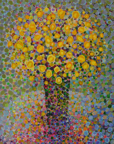
| Floral Abstract by Angelo Franco |
I also think that at least intellectually I understand how an abstract art work can represent a feeling or mood or emotion.... Guernica comes to mind.
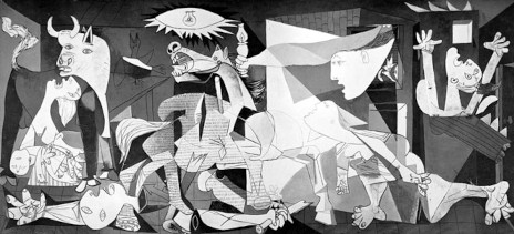 |
| Pablo Picasso, Guernica, 1937 |
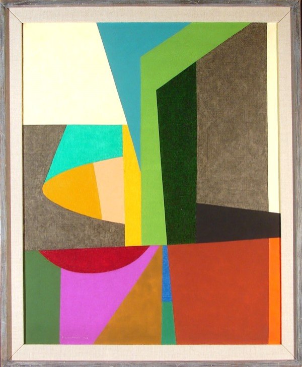
I also understand how a work can be purely abstract, only "about" shape, color, line, etc. (at least apparently purely, maybe the artist thought differently). For example, this piece called "Intro" by Frederick Hammersley, 1958.
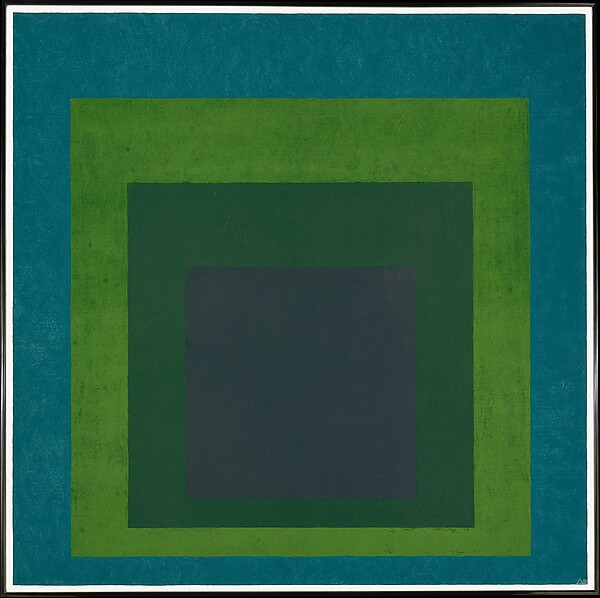
Josef Albers' work is "about" colors and shapes.
I started thinking about this after my last post, and the doodle/sketch of a composition that was made up of relatively random shapes on grid paper. My first criticism or concern was that it was too irregular and didn't have any focal point, hierarchy, etc. It did have balance, in a sense, I guess, because the pattern was equally dispersed over the entire field, (or would be if I finished it).
 |
| (The pink is only because I forgot the orange marker, but I might like the concept) |
Can a work of abstract art "just" be an overall interesting surface pattern? I tried to find examples of this in art quilts.
The first one I thought of was Benedicte Caneill's work.
 |
| Units #23: Lights in Blue |
I've seen her work in a number of different books and exhibits. It ranges from figurative, to repetitive blocks, to more overall pattern, which this piece seems to be. However, as I looked closer at it, I saw that it is made up of various blocks or units, but I think the effect is still overall pattern or texture.
Here is Meiny Vermaas-van der Heide:
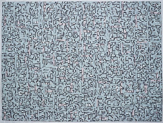 |
| Earth Quilt #1 - Celebration of Life II |
I've selected one of her more homogeneous examples to illustrate my point. Again the overall impression is of a continuous texture. So maybe my question really is "When is overall homogeneous or non-focused texture Art, and when is it just a really cool texture?"
Nelda Warkentin was an artist that immediately came to mind as I considered this question.
Here is Sea Ice:
Her signature style is a recombination of similarly painted, multi-layered blocks, usually square, into new configurations. While there is less homogeneity than the first two examples, the overall effect is still one of texture, not object, shape or focus. Her artist's statement says: "My work, which can be representational or abstract, is about color and pattern. Design elements found in Nature are my inspiration. Color is used to convey light in a landscape, a mood or emotion. "
I didn't find too many more examples that I thought qualified as "purely" homogeneous texture. Nearly all quilts that have a textural feel at first impression are composed of small, similar repeated blocks. This is the nature of an art quilt - unless it's painted... Here are some other examples I considered. Ann Brauer creates texture and color gradation in her pieces, which are often vertical columns of very similar small strip sections. But instead of the pure texture, which would be pretty boring, she brings a simple shape in, which becomes so much more interesting, for its uniqueness.
In the next piece, Sea Spray, by Valerie Maser-Flanagan, the first impression at a distance is of a texture that graduates from greenish gray through blue to blue-gray. The viewer is immediately drawn in to see how the effect is achieved, by a repetition of small and medium sized blocks, which are themselves each compiled of a number of similar but not exactly the same blocks. This adds multiple levels of interest to the piece.
There are an unlimited number of art quilts made up of square or rectangular repeated modules. If the modules are similar enough and there are enough of them, texture is created.If I were to try to define it, I would say that the definition of texture in art is: repetition of a similar shape, color, or pattern applied consistently over an area. In Nancy Crow's Sets and Variables class this year we learned this lesson by experience. These don't look very texture-y up close but seen from a distance they definitely blend into a fairly homogeneous blur. But I don't particularly think they are works of art in their own right.
Here's a really cool example by Melody Johnson where figures are just barely discernible within the texture.
 |
| Four Square Circles |
I started to look for examples in other media where the dominant design element is overall texture or pattern. There are lots of them! Jackson Pollock, of course.
 |
| Jackson Pollack: Lavender Mist, No. 1 1950 |
 |
| Red on Maroon, 1959 |
But when the number of squares becomes smaller, it doesn't.
This one is texture-ish, but also had great figure/ground.
 |
| Meschers, 1951 |
Sean Scully creates subtle shape and color patterns within his overall pattern. This really looks like it could have or should have been a quilt. I would like to try that out....
 |
| Red Light, 1971 |
I like this piece by Klee, even though it isn't exactly homogeneous texture, it does have overall balance. I particularly like it because it incorporates mark making that begins to represent symbols or language, another pet topic of mine.
Wandering farther down that path, here is a piece by Elina Asins titled Scale (diptych). Very oddly, when I found this on Pinterest, and only half was shown. I love the way it starts to look like an architectural plan. It is interesting to try to identify the point where the brain stops trying to discern what the "thing" or shape or structure is, and just says, "Oh, that's just a bunch of random stuff." By having it repeated positive/negative it reinforces that it is "something," because they are both the same, and you (Or actually I) want to figure out if they are exactly the same.
Athos Bulcao was a Brazilian artist best known for his blue and white ceramic tile work in the new city of Brasilia. Here's a shot that I really loved for it's asymmetry and pattern. most of his other work appears to be more decorative, repeated patterns. I have not found an image that shows all of this installation yet, I would love to see it in context. It seems like he created himself a vocabulary of half-circles, straight lines, Ts and L's and then just went crazy arranging them.
Sort of like a Nancy Crow assignment, "Make 7,500 of each, and then I'll tell you what happens next." :)
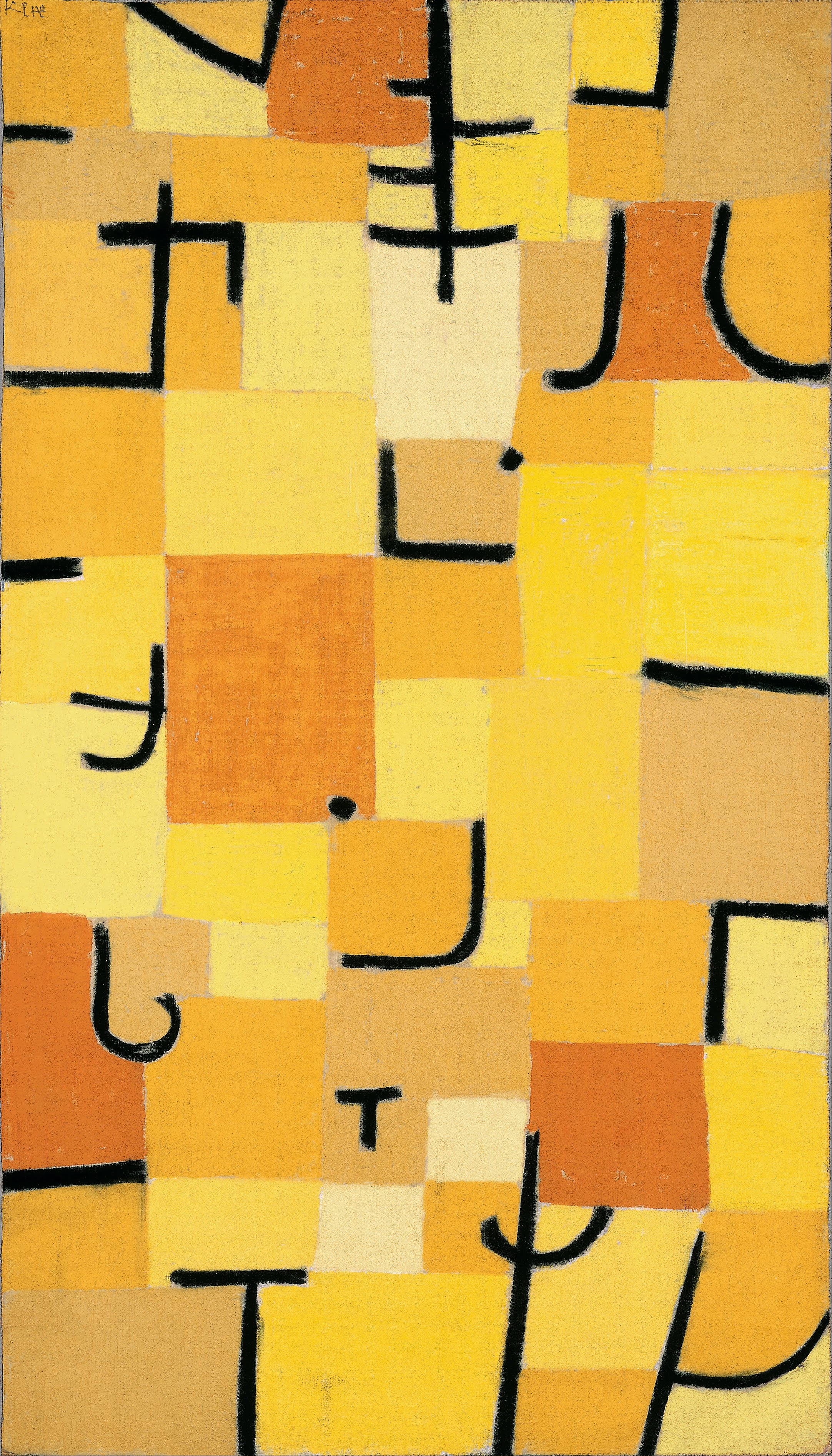 |
| Signs in Yellow, 1937 |
Athos Bulcao was a Brazilian artist best known for his blue and white ceramic tile work in the new city of Brasilia. Here's a shot that I really loved for it's asymmetry and pattern. most of his other work appears to be more decorative, repeated patterns. I have not found an image that shows all of this installation yet, I would love to see it in context. It seems like he created himself a vocabulary of half-circles, straight lines, Ts and L's and then just went crazy arranging them.
Sort of like a Nancy Crow assignment, "Make 7,500 of each, and then I'll tell you what happens next." :)
I think that's enough musing for awhile. Perhaps I should take a class on abstraction, but I don't really want to follow someone else's exercises. I guess I'd rather just study abstraction on my own. I'm really interested in what others might have to say on the topic. Please leave a comment!


%204.JPG)


