Showing posts with label musing. Show all posts

Tuesday, May 13, 2014

Musings on Abstraction and Texture

I've been thinking recently about what makes good abstract art.  Abstraction can occur on a continuum from "almost real" to completely unrelated to reality.  I think I have a general understanding of how to abstract something from reality - either slightly, or so much that the original subject is not recognizable.  This piece is pretty far from realism, but still easily recognizable.
Floral Abstract by Angelo Franco

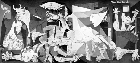
I also think that at least intellectually I understand how an abstract art work can represent a feeling or mood or emotion....  Guernica comes to mind.
Pablo Picasso, Guernica, 1937

I also understand how a work can be purely abstract, only "about" shape, color, line, etc.  (at least apparently purely, maybe the artist thought differently).  For example, this piece called "Intro" by Frederick Hammersley, 1958. 


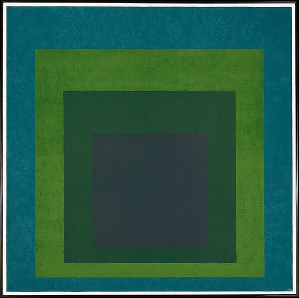
Josef Albers' work is "about" colors and shapes.

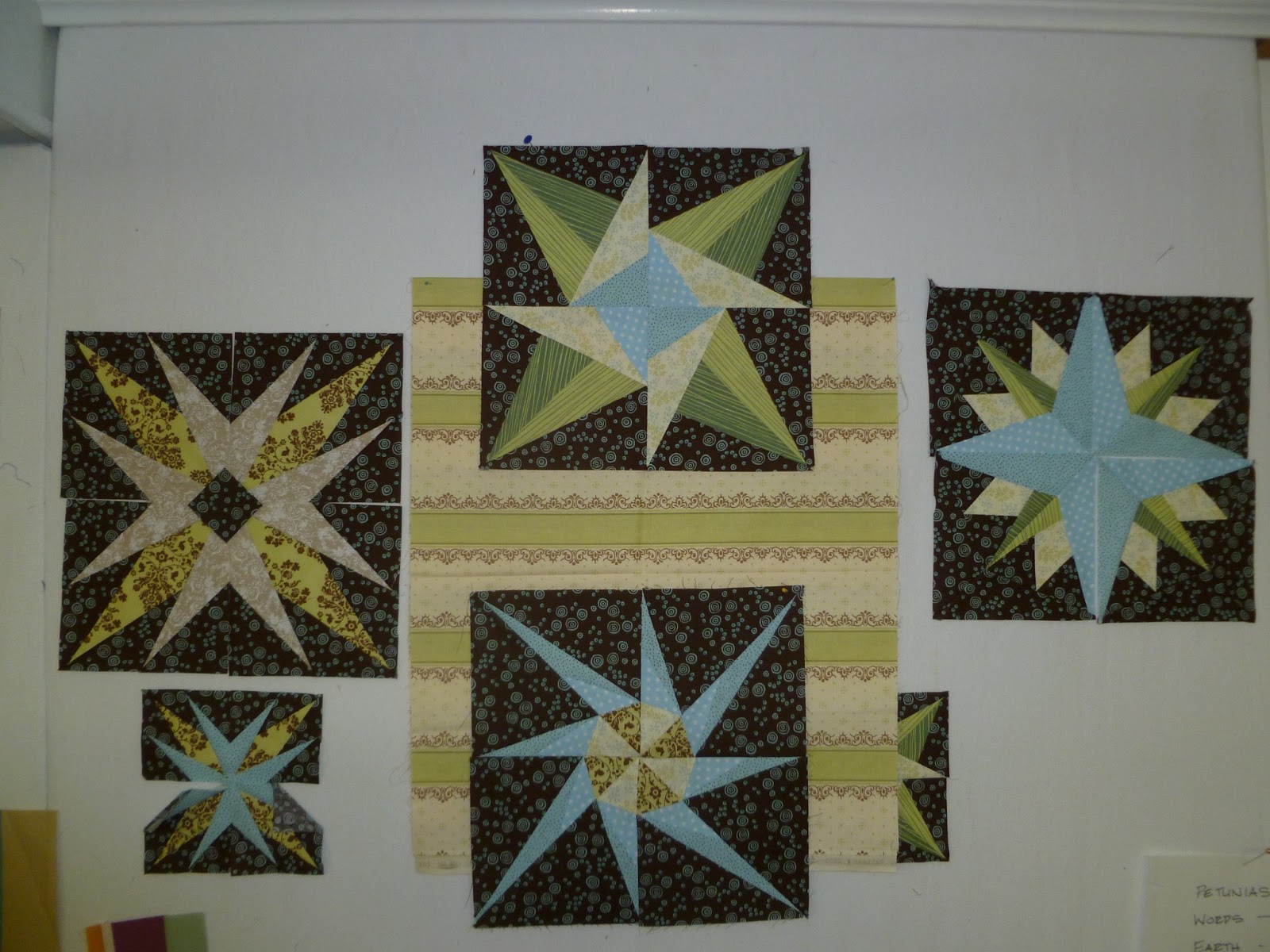
I started thinking about this after my last post, and the doodle/sketch of a composition that was made up of relatively random shapes on grid paper.  My first criticism or concern was that it was too irregular and didn't have any focal point, hierarchy, etc.   It did have balance, in a sense, I guess, because the pattern was equally dispersed over the entire field, (or would be if I finished it).

(The pink is only because I forgot the orange marker, but I might like the concept)

Can a work of abstract art "just" be an overall interesting surface pattern?  I tried to find examples of this in art quilts.

The first one I thought of was  Benedicte Caneill's work.
Units #23: Lights in Blue

I've seen her work in a number of different books and exhibits.  It ranges from figurative, to repetitive blocks, to more overall pattern, which this piece seems to be.  However, as I looked closer at it, I saw that it is made up of various blocks or units, but I think the effect is still overall pattern or texture.

Earth Quilt #1 - Celebration of Life II

I've selected one of her more homogeneous examples to illustrate my point.  Again the overall impression is of a continuous texture.  So maybe my question really is "When is overall homogeneous or non-focused texture Art, and when is it just a really cool texture?"  

Nelda Warkentin was an artist that immediately came to mind as I considered this question. 
Here is Sea Ice: 


Her signature style is a recombination of similarly painted, multi-layered blocks, usually square, into new configurations.  While there is less homogeneity than the first two examples, the overall effect is still one of texture, not object, shape or focus.  Her artist's statement says: "My work, which can be representational or abstract, is about color and pattern. Design elements found in Nature are my inspiration.  Color is used to convey light in a landscape, a mood or emotion. "   

I didn't find too many more examples that I thought qualified as "purely" homogeneous texture. Nearly all quilts that have a textural feel at first impression are composed of small, similar repeated blocks.  This is the nature of an art quilt - unless it's painted...  Here are some other examples I considered.  Ann Brauer creates texture and color gradation in her pieces, which are often vertical columns of very similar small strip sections.  But instead of the pure texture, which would be pretty boring, she brings a simple shape in, which becomes so much more interesting, for its uniqueness.

 In the next piece, Sea Spray, by Valerie Maser-Flanagan, the first impression at a distance is of a texture that graduates from greenish gray through blue to blue-gray.  The viewer is immediately drawn in to see how the effect is achieved, by a repetition of small and medium sized blocks, which are themselves each compiled of a number of similar but not exactly the same blocks.  This adds multiple levels of interest to the piece.


There are an unlimited number of art quilts made up of square or rectangular repeated modules.  If the modules are similar enough and there are enough of them, texture is created.If I were to try to define it, I would say that the definition of texture in art is: repetition of a similar shape, color, or pattern applied consistently over an area.  In Nancy Crow's Sets and Variables class this year we learned this lesson  by experience. These don't look very texture-y up close but seen from a distance they definitely blend into a fairly homogeneous blur.  But I don't particularly think they are works of art in their own right.  


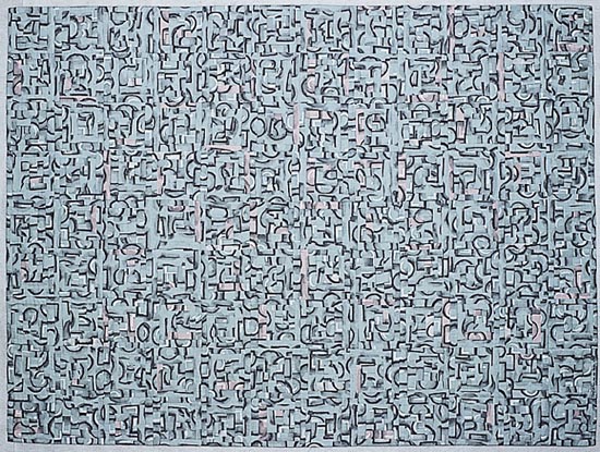
Here's a really cool example by Melody Johnson where figures are just barely discernible within the texture.
Four Square Circles
I started to look for examples in other media where the dominant design element is overall texture or pattern.  There are lots of them! Jackson Pollock, of course.
Jackson Pollack: Lavender Mist, No. 1 1950
Mark Rothko makes you look very hard to discern pattern within the texture.
Red on Maroon, 1959
There are all sorts of examples from Ellsworth Kelly.  This one reads as texture, I think:

But when the number of squares becomes smaller, it doesn't. 


This one is texture-ish, but also had great figure/ground.

Meschers, 1951


Sean Scully creates subtle shape and color patterns within his overall pattern.  This really looks like it could have or should have been a  quilt.  I would like to try that out....
Red Light, 1971
I like this piece by Klee, even though it isn't exactly homogeneous texture, it does have overall balance.  I particularly like it because it incorporates mark making that begins to represent symbols or language, another pet topic of mine.
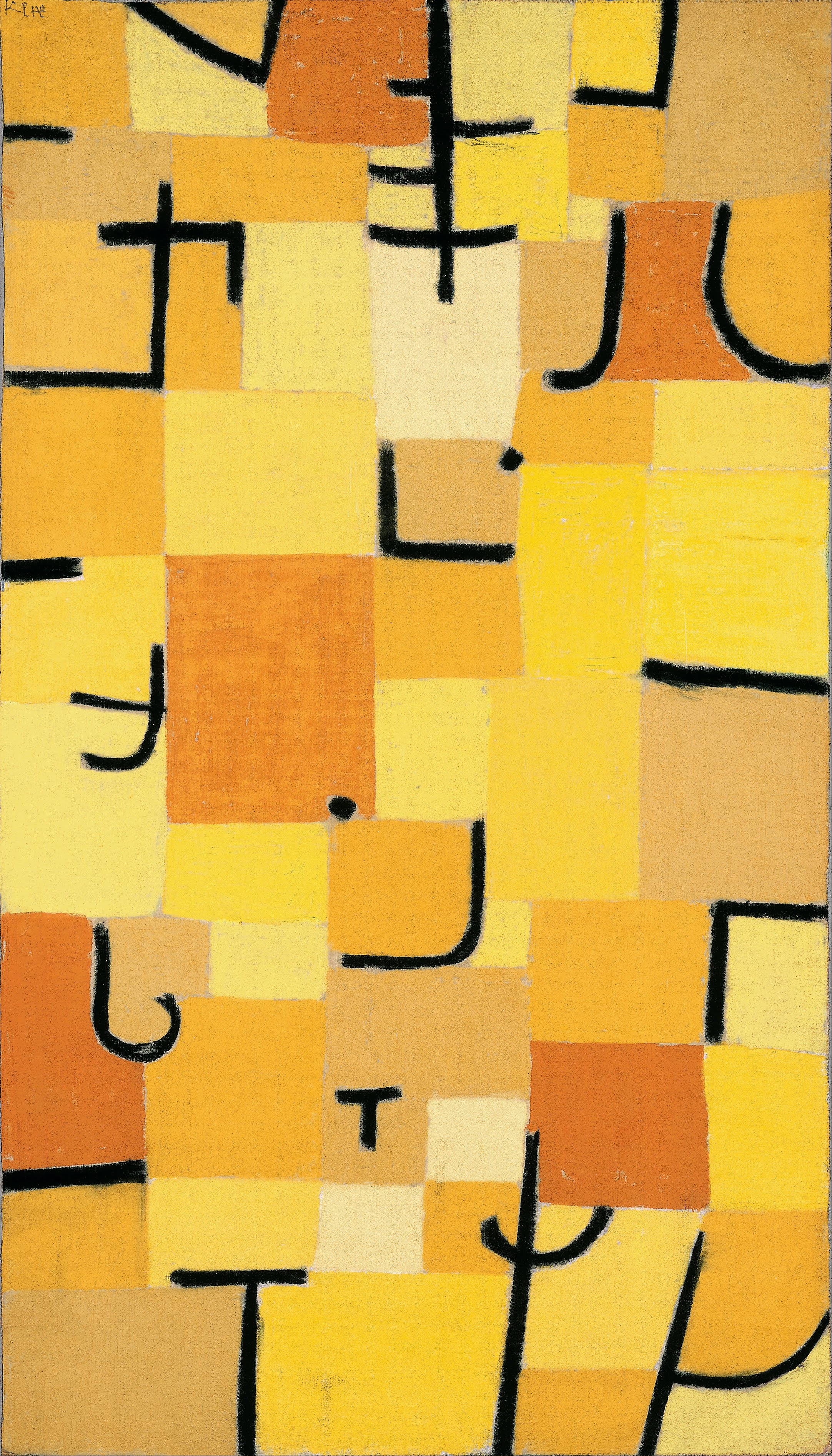
Signs in Yellow, 1937
Wandering farther down that path, here is a piece by Elina Asins titled Scale (diptych).  Very oddly, when I found this on Pinterest, and only half was shown. I love the way it starts to look like an architectural plan.  It is interesting to try to identify the point where the brain stops trying to discern what the "thing" or shape or structure is, and just says, "Oh, that's just a bunch of random stuff."  By having it repeated positive/negative it reinforces that it is "something," because they are both the same, and you  (Or actually I) want to figure out if they are exactly the same.

Athos Bulcao was a Brazilian artist best known for his blue and white ceramic tile work in the new city of Brasilia.  Here's a shot that I really loved for it's asymmetry and pattern. most of his other work appears to be more decorative, repeated patterns.    I have not found an image that shows all of this installation yet, I would love to see it in context.  It seems like he created himself a vocabulary of half-circles, straight lines, Ts and L's and then just went crazy arranging them.
Sort of like a Nancy Crow assignment,  "Make 7,500 of each, and then I'll tell you what happens next."  :)

I think that's enough musing for awhile.    Perhaps I should take a class on abstraction, but I don't really want to follow someone else's exercises.  I guess I'd rather just study abstraction on my own.  I'm really interested in what others might have to say on the topic.  Please leave a comment!

Wednesday, February 12, 2014

Six Weeks Into 2014

Updating my blog has not been a high priority.  That's actually a good thing, I think, because it means I'm probably busy doing something more productive.  But I suddenly realized we are a month and a half into 2014.  If you have a brain like mine that automatically starts calculating things, you'll already know that is 1/8th of the year over!    So I decided to update instead of doing yoga this morning.  :(

It also means that Nancy Crow workshops are only a couple weeks away!!!!!  ACK!  How did that happen?  I was supposed to have ten new quilt tops to show!!  And I need all those motifs sewed up!!!

I have been sketching motifs like crazy - at work, on the ipad, in a sketchbook, occasionally.  But no choosing or sewing.  So I'd better start.  Instead I've been trying to get tops done to take for show and tell.

I need to put in a big fabric order, too.  In preparation, I bought myself a new Kona card.  Yay!


Here's a quick photo-journey of recent weeks for you:

This Christmas wall hanging didn't get done in time for display this year,
so I figured I'd better get it done before I put it away and forget about it until it's too late again next year.
It just needs binding and a pocket to hold the battery pack now.

I sandwiched and quilted this little guy.
Mistake: Black batting makes the seams show through in the pink.
(I assure you that is hot pink, regardless of what my camera thinks.
I was worried about white fuzz in the dark gray.

This little tidbit was a piece left over from the Color Prints series.
I cut it down to size and made an "envelope" backing
for the SAQA "trunk show" but I didn't  like how lumpy and crooked it was.
So it will probably become a "mug rug."
Went off track with some  "functional sewing."
 This old white shoe-lace lanyard-thingy for my Rotary name tag was just looking too tatty to wear in public,
so I had the idea to make a patchwork one.
It only took and hour (Really!) and was made out of little scrap strips just sitting on the table.  

Most of my studio time recently has been spent on finishing up the Bull's Eye project from last years' N.C. workshops.
After assembling the first circle last year, I had forgotten the formula for cutting the arcs to fit the circles,
so that took some mistakes and recutting.
Thankfully I did one at a time.
As I get into it I am really liking it.
The biggest issue is that the cutting and re-piecing of the circle's parts made them much smaller than the original arcs so the arcs had to be reshaped, making them short/crooked.  Like the orange on the lower left circle.
So I have been piecing in extra fabric to make the blocks rectangular.
(Square is a stretch (literally).  I'm happy with rectangular).
I really hope I will have this top ready to take to the workshop.

Binding and beading some old projects is my work for Olympics TV time.


I pulled this pile of print fabrics, with the hope/dream of making a couple more Color Prints pieces before the workshop.
All I have to do is  make strip pieced fabrics, and compose and assemble something.
Sure, why not?
Okay, I'm publicly challenging myself here!
I would love to rebuild this piece too, but there is much to be done there.
Like start over.  Get rid of those "medium light" fabrics.
I'm not sure what Nancy intended with this exercise, but I know I killed something I loved
by attempting to comply with her direction to use very light and then medium light backgrounds.
After Christmas I put up a little gallery of finished projects in the hall, and immediately became depressed at how few I have and how old they are!  Like the Orange Chair.  :P

This fabric is persistently calling my name.  I think it would make a great Stack n' Wack but that's not a very creative idea, so I'm waiting to find out if it wants to be part of a Color Prints piece.  it's just so "already done" in itself that I'm not sure I can do anything else interesting with it.

That's about it for the first 1/8th of 2014.   

Monday, January 13, 2014

Resolutions Old & New

2013 Art Quilting Resolutions

  • Focus on Art Quilts!!!        Well, Duh!
  • Study and practice Crow assignments   I at least worked on finishing, didn't really "study" much.
  • Enter SAQA Show  I did.  Got rejected, but I entered.
  • Enter Whatcom Museum Show  I did.
  • Work in a Series: Strip Piecing  I did.  This turned into "Color Prints."
  • Work in a Series: Map Quilts   Did not do anything with this.  
  • Work in a Series: Words  I did, in a way.  Took apart "Asemia" and made it five small quilts.
  • Resist temptation to do "functional" stuff   Eh... maybe.  I needed curtains, and had to finish Sophia's quilt.
  • Finish or give up on the current UFO's  Making some progress here.
  • Learn to photograph my quilts    Needs lots of work!
  • Learn to use Photoshop Elements  Need more work.


2014 Art Quilting Resolutions
  • Study hard with/after Nancy Crow
  • Study design and composition
  • Study color
  • Continue "Color Prints" series.  See where it leads.
  • Make labels for all completed quilts still in my possession.
  • Make hanging sleeves for all completed quilts still in my possession.
  • Resist temptation to do "functional" stuff   
  • Finish or give up on the current UFO's  
  • Learn to photograph my quilts    
  • Learn to use Photoshop Elements  
  • Enter at least one SAQA show, besides the trunk show.

Monday, January 6, 2014

Word of the Year

Everyone in the blogosphere has been sharing their word or phrase for the year.  Lots of Joy, Focus, Finish, Commitment, etc.

I thought for awhile.  I read something in a blog about a Nancy Crow workshop about how you have to give up some things if you want some other things... I.e. success as an artist.

So I decided my word is "Sacrifice."

I have been trying over the last few years to be a more positive person.  That doesn't always come naturally to me.  But I feel like this word sums up what my attitude has to be.  For too many years - like, oh, about fifty - I have convinced myself and others that I can "do it all."  Career, Rotary, Planning Commission, Art, Home, Garden... etc.

I have to face the fact that I can't.  The success that I crave as an artist is going to have to come at the expense of weeds in the perennial border, or tomatoes that rot on the vine.  The bedroom might not get painted, and the dog will have mats under his ears.  It's worth it.

I could use "trade-offs" as a slightly less negative word, but I think that "sacrifice" gets closer to the heart of it.  What sacrifices are you willing to make for your art?  

Friday, January 3, 2014

2013 Retrospective

Yeah, everyone's doing it and it may be really boring to read but this blog is primarily for me to chronicle my adventures, and if others find it interesting, okay.  So, with that disclaimer here's my visual look back at 2013.  I realize that some of these quilt tops have been completed but I never photographed them since they weren't quilted and faced. Maybe I'll do that this weekend, and update the entry.  I hvae decided that in 2014, the definition of "done" will be completed quilt tops.  I need to accept that not every exercise is worthy of quilting well, but also not bad enough to use for practice.

Here's to a productive, creative 2014 for all of us!